
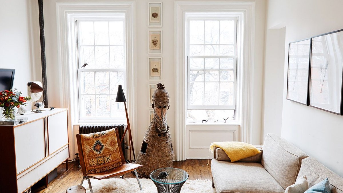
Why some spaces feel bigger has long puzzled designers, yet recent research shows the illusion stems from how our visual system processes depth cues, light, color and surface texture, creating a subtle but powerful effect on how rooms are experienced.
Visual cues that the brain interprets as depth
The eye tracks lines that converge toward a vanishing point, such as ceiling beams or floorboards that narrow with distance. When these lines tighten, the brain registers “farther away” and the interior seems to stretch, giving the impression of added length.
Objects that partially hide one another create layers; this occlusion tells the mind that one element sits behind another, adding a sense of volume beyond the immediate walls and enriching the spatial story.
Every familiar item—chairs, doors, artwork—acts as a scale reference. When a known object appears smaller, the surrounding environment is judged larger, because the brain uses the familiar size as a yardstick for space.
Texture gradients also play a part. Fine patterns become denser as they recede, reinforcing the impression that surfaces extend into the distance and subtly guiding the eye toward the back of the room.
In practice, designers can amplify these signals by keeping sightlines uninterrupted, using long, straight runs of flooring or shelving that guide the eye outward, allowing the brain to follow a continuous visual path.
Light, daylight and color as spatial tools
Daylight behaves like a building material; its direction, brightness and shadow softness shape perceived volume. Light entering from a single side produces a gradient that the brain follows like a hallway, making the interior feel deeper and more inviting.
Light shapes perception.
When light comes from multiple directions the effect flattens because the eye loses a dominant cue for distance. A purposeful hierarchy—bright ceiling, softer walls, helps maintain a sense of height and prevents the space from feeling compressed.
Moving light across the long axis of an interior, for example from a window to the opposite wall, exaggerates length without structural changes, allowing occupants to sense an extended corridor even in modest footprints.
Keeping the brightest area on vertical surfaces rather than the floor suggests “more wall” beyond the immediate perimeter, encouraging the mind to expand the perceived boundaries of the room.
Soft shadows, created by diffused daylight or sheer window treatments, hint at a distant light source and reduce hard edges that would otherwise define a confined box, resulting in a more open feeling.
Color value and saturation further influence perception. Light hues reflect more illumination, softening edges and allowing planes to blend, while darker tones absorb light, sharpening boundaries and pulling surfaces forward toward the viewer.
A narrow range of values across walls and ceiling, combined with low saturation on large surfaces, makes the interior feel airy, while high‑contrast accents on small objects draw the eye without shrinking the space, balancing visual interest with openness.
Geometry, lines and texture management
Consistent alignment of architectural elements creates visual rhythm. Parallel lines, such as slats, trim or shelving, extend the eye’s path, reducing “stops” that break the sense of openness and guiding the gaze smoothly across the room.
Proportion acts as spatial grammar; when furniture and openings share a unified scale, the environment feels intentional rather than crowded, reinforcing a harmonious relationship between objects and architecture.
Misaligned angles introduce visual noise, forcing the brain to constantly re‑orient and making the area feel tighter, as the eye struggles to find a clear direction.
Texture plays a subtle role. Smooth, uninterrupted surfaces act like calm water, letting sightlines glide effortlessly, while overly busy patterns generate micro‑segments that the eye reads as smaller compartments, fragmenting the space.
They often limit pattern vocabularies to a single family, stripe or check, using it in no more than two locations, and reserve richer textures for tactile zones like a rug or a feature wall, ensuring that pattern does not overwhelm the sense of scale.
Finishes that balance matte absorption with gentle reflection, such as satin paint, can expand perceived space when applied to large planes, while glossy accents should be used sparingly to avoid visual clutter and maintain a calm atmosphere.
One practical tip is to keep the first meter in front of a window clear of tall furniture; this allows daylight to flow uninterrupted, reinforcing the illusion of depth and keeping the area feeling bright.
While the science explains the mechanics, the real impact lies in everyday experience. A modest studio can feel as expansive as a larger apartment when designers apply these principles, turning limited footprints into comfortable, breathable environments. The interplay of light, line and texture shows that perception often outweighs square footage in shaping how we inhabit built environments.


