
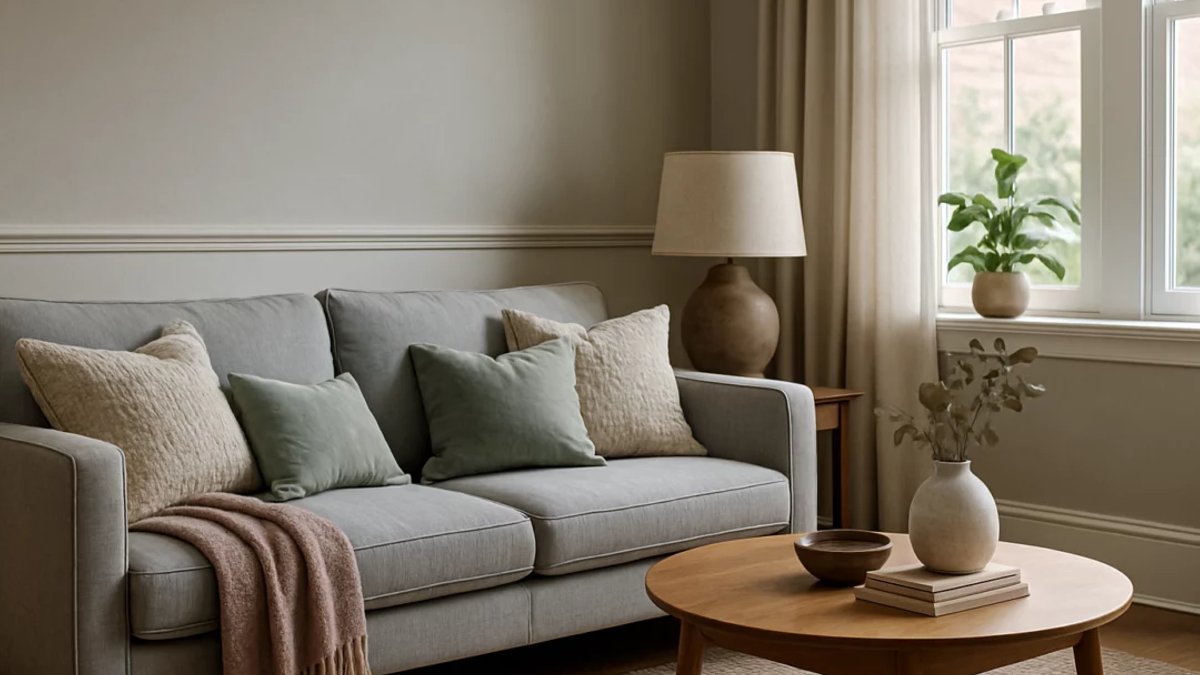
Designers are turning to a broader range of neutral colors as they move away from the long‑standing dominance of beige, seeking fresh ways to shape interiors without overwhelming the eye. This shift reflects a desire for subtle sophistication.
Expanding the Palette Beyond Beige
Beyond the familiar tan, shades such as grey, taupe, soft whites and muted pastels are gaining traction. Each offers a distinct mood, allowing creators to tailor rooms from tranquil retreats to energetic workspaces. Professionals note that these hues can be layered to produce subtle atmospheres without relying on bold pigments.
Light grey can lift a room, while deeper dark colors add a sense of intimacy. Pairing these tones with warm wood grain or brushed metal often enhances visual interest, creating a balanced backdrop that feels both modern and welcoming.
Soft Whites and Their Role
White is no longer a single flat hue; variations with cream or pale gray undertones introduce subtle warmth. In compact areas, such shades reflect light, making the space feel larger. Designers frequently combine these whites with natural textures to avoid a sterile appearance.
When bright accessories—think teal cushions or a mustard vase—are introduced, the overall look gains contrast without sacrificing serenity. The contrast highlights the softness of the base while keeping the palette cohesive.
Warm Taupe and Muted Pastels
Taupe blends brown and gray, delivering a refined backdrop that works in both classic and modern settings. Upholstered pieces or wall finishes in this tone can anchor diverse décor elements, acting as a quiet stage for art or furniture.
Muted pastels like soft blush, sage green and powder blue are being positioned as alternatives to traditional greys. A blush sofa, for example, can serve as a low‑key focal point while letting surrounding items stand out. These pastel options also pair well with natural fibers such as linen and jute.
Homeowners find that these options translate into greater flexibility. Choosing a subtle hue that still feels personal can make a room feel both inviting and uniquely theirs. The ability to switch accent pieces without repainting adds practical value.
Balancing and Adding Depth
Layering multiple shades of the same family creates depth; a series of grays ranging from pale to deep can appear cohesive yet dynamic. Textiles such as wool throws or velvet cushions add tactile richness, encouraging occupants to linger.
To avoid a flat appearance, designers often introduce bold accent colors. Items like a burnt‑orange lamp or teal artwork inject energy, allowing the base palette to adapt to evolving tastes. This strategy keeps interiors feeling fresh over time.
Real‑World Applications
Recent projects illustrate the shift. A modern residence featuring a mix of soft grays and whites exudes calm, ideal for unwinding after a busy day. Conversely, a rustic cabin with taupe walls and pastel furnishings feels cozy and lived‑in, demonstrating versatility across contexts.
In private quarters, a bedroom painted in sage green with white trim promotes restfulness, while a home office dressed in gray tones punctuated by vivid décor supports focus and creativity. Each setting benefits from the calming influence of neutrals balanced by purposeful pops of color.
Neutral tones never dominate.
Adoption of these expanded hues is growing among both professionals and DIY enthusiasts, suggesting a lasting move toward richer, more adaptable palettes in interior design. The trend appears to be supported by increased availability of paint collections that emphasize subtle variations, allowing anyone to experiment without committing to a single bold shade.


