
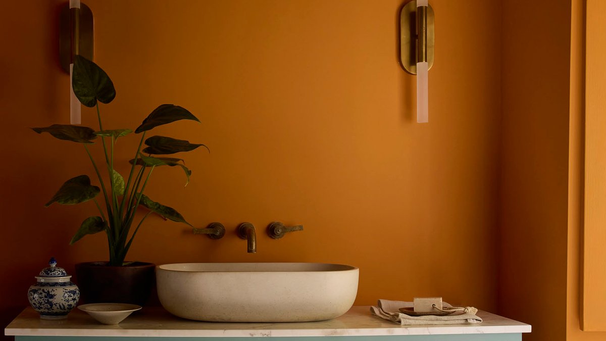
The conversation around color and interiors often seems to swing between extremes, with barely-there neutrals or bold, saturated hues dominating the design world. However, according to Little Greene Paint & Paper’s Creative Director Ruth Mottershead, the next chapter in color trends is neither too warm nor too cool, but rather a balanced approach.
This shift is reflected in the brand’s updated Colours of England and Colour Scales collections, which encourage designers and homeowners to use soft, balanced, and personality-filled shades. The new collections feature a range of gentle, less saturated hues that are perfect for creating a calming and considered atmosphere in the home.
Understanding the Shift in Color Trends
Ruth Mottershead notes that the move away from warm, saturated tones is an evolution rather than a sudden change, with color trends shifting gradually over time. She explains that the red oxide and heat that once sat behind caramels and burnt oranges has softened into gentler, more balanced hues, resulting in a growing popularity of comfortable mid-shades that are neither too warm nor too cool.
These mid-shades, which sit at around 5 or 6 on the pH scale, offer a sense of personality without being too overwhelming. Ruth Mottershead believes that this shift is driven by a desire for homes to feel calm and considered, rather than simply following the latest trends. The use of gelato-inspired colors in schemes is also becoming more popular, as people seek to create a sense of warmth and personality in their homes.
Building a Timeless Color Palette
For those starting the decorating process, Ruth Mottershead advises opting for colors that are loved, rather than following trends. She recommends considering how the space should make you feel and thinking about how the light treats the room. By choosing a hero color and building outwards with one or two shades that share the same undertone, you can create a connected and harmonious scheme.
Ruth Mottershead is particularly excited about the new shade ‘Perpetual Blue’, which is taken from a surviving paint palette belonging to Winston Churchill. This mid to deep blue has a touch of green running through it, making it respond beautifully to changing light throughout the day. It’s a versatile shade that can be used to create a dramatic and color-drenched atmosphere in a study or as a grounding note against softer neutrals.


